Organizing your data
This page covers the arrangement of the window: what you can reorder, what persists, where it is stored, and what the window does while you are in Play Mode.
Reordering
Three lists can be reordered, and all three persist.
Namespaces
Each namespace header has ↑ and ↓. ↑ moves the namespace to the top of the list, ↓ to the bottom. The buttons disable at the ends, so the control tells you when there is nowhere to go.
You can also drag a namespace header to any position. The dragged row follows the pointer and shows a ghost of its label.
Types
Each type row has ↑ and ↓ with the same top-and-bottom behavior, scoped to its own namespace. Types can also be dragged, within and across namespaces.
Objects
Each object row has ↑ and ↓, which move that object to the top or bottom of the list for its type. ↓ is disabled on the last row.
Objects can also be dragged directly. The list reorders as you drag, and the new order is saved.
The X on a namespace header or a type row removes it from DxVisualizer. This is not destructive: your assets stay on disk. Removal is offered only for types that are neither
BaseDataObject subclasses nor types carrying [CustomDataVisualization], because the window manages those types for you.
Collapsing namespaces
The arrow on a namespace header collapses and expands its types. Collapse state persists per namespace.
Pane widths
The two splitters between the three panels save their widths, so the arrangement survives a reopen. Widths are saved per user through Unity's editor preferences, independently of the persistence setting below. A width is normalized so it cannot go below the pane's minimum, and the window remembers your preferred size separately from a size the window had to clamp to, so shrinking the editor and growing it back does not overwrite your choice.
Persistence
One setting decides where the window's state lives: which namespace and type you had selected, which object was selected in each type, the namespace, type, and object ordering, collapse state, the types you track, the per-type label filters, and the per-type processor scope and collapse state.
Persist in user state
Leaving Persist State in Settings Asset off (the default) writes state as JSON to DataVisualizerUserState.json in Unity's per-user persistent data path. Each developer keeps
a private arrangement and version control stays free of layout churn.
Persist in a project settings asset
Turning Persist State in Settings Asset on stores the same state inside a DataVisualizerSettings asset in the project. DxVisualizer creates one at
Assets/Editor/DataVisualizerSettings.asset on first use if no DataVisualizerSettings asset exists, and uses the first one it finds if you have several. This suits a team that
wants one shared arrangement, at the cost of layout churn in version control.
Switching between the two copies the current state across, so you do not lose your arrangement when you toggle.
What is never shared
The Data Folder and the selectActiveObject preference stay with the DataVisualizerSettings asset regardless of where the window state lives; the pane widths always stay in
editor preferences.
Other settings
The Settings popover opens from the … button in the header row.
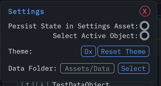 Settings popover. Regenerated from the live window by the docs capture
pipeline.
Settings popover. Regenerated from the live window by the docs capture
pipeline.
- Select Active Object mirrors your DxVisualizer selection in Unity's own Inspector, for cross-referencing assets in other editor windows.
- Theme picks the appearance. See Themes.
- Data Folder is where new assets are created. Click the path to ping the folder, or Select to browse. The target must be inside
Assets. Clones are unaffected: they stay beside their original.
Themes
Six themes ship in the package: Dx, Classic, Nord, Dracula, Compact, and Minimal. Dx is the default: ink-dark surfaces with an azure accent, and the family hues for actions. Compact and Minimal keep the Classic palette and shrink the density: Compact uses 13px type, 20px action buttons, and 4px control corners; Minimal uses 12px type, 16px action buttons, and square corners.
Click the theme field to open a searchable dropdown. Search by name or asset path, use Up and Down to move, Enter to select, Escape to cancel. Themes from both Assets and
Packages are listed, and a duplicate name shows its path so you can tell them apart.
Reset Theme restores the Dx appearance and clears the saved theme selection, keeping the compact Data Folder button sizing. Selecting the Dx asset gives the same appearance but keeps an explicit selection.
Your own theme
Create one with Assets → Create → Wallstop Studios → DxVisualizer → DxVisualizer Theme, assign a .uss asset to its Style Sheet field, then pick it in Settings →
Theme. Keep the theme and its stylesheet under an Editor folder; they are editor-only assets.
The stylesheet you assign is applied after the package stylesheet, and standard control rules are scoped to .dataviz-root inside the DxVisualizer window. Ordinary USS precedence
still applies, and inline styles win. Data color swatches and label colors stay data-driven, and IMGUI or third-party inspector styling is not replaced.
Override the tokens you need rather than restyling controls:
:root {
    --dataviz-accent: #88c0d0;
    --dataviz-background: #2e3440;
    --dataviz-control-hover: #88c0d0;
    --dataviz-control-pressed: #81a1c1;
    --dataviz-on-accent: #2e3440;
    --dataviz-font-size: 15px;
    --dataviz-circle-size: 32px;
}
Use Dx.uss, Nord.uss, or Dracula.uss as palette references. Copy them under your project's Editor folder before customizing rather than editing installed package files.
Theme changes apply to the open window without reselecting or reopening it. Editing the applied theme's stylesheet, changing its Style Sheet reference, and renaming or moving either asset all update immediately. Deleting the applied theme falls back to the package style without discarding the saved GUID; reset clears that reference too.
The selected theme follows the persistence setting above, so a theme chosen in user state is yours alone and one chosen in the settings asset is shared.
While the editor is playing
Entering Play Mode suspends package-driven work. The window keeps the last loaded view and shows Package editing is paused during Play Mode. While it is paused:
- Create, the add-type controls, and the processor switch are disabled.
- The inspector is disabled and shows read-only content.
- Asset operations are refused: clone, rename, move, delete, and label changes.
- Selecting another type does not load its instances, and the catalog does not change.
Everything resumes when you leave Play Mode.
Next steps
- Search and filtering — find and narrow your data.
- Managing assets — create, rename, move, clone, delete, and batch-process.
- Extending the window — attributes, lifecycle hooks, custom inspector content.