Unity Helpers

Treasure chest of Unity developer tools. Professional inspector tooling, high-performance utilities, spatial queries, and 20+ editor tools.
Inspector Settings Reference
Centralized configuration for all inspector features.
The UnityHelpersSettings asset provides project-wide configuration for pagination, colors, animations, and history capacity across all inspector attributes and custom drawers. Configure once, apply everywhere.
Table of Contents
- Accessing Settings
- Pagination Settings
- WButton Settings
- WGroup Settings
- Inline Editor Settings
- Color Palettes
- WEnumToggleButtons Settings
- Creating the Settings Asset
Accessing Settings
Location: ProjectSettings/UnityHelpersSettings.asset
Access in Unity:
- Open Project Settings window (
Edit > Project Settings) - Scroll to the “Unity Helpers” section (if available)
- Or navigate to
ProjectSettings/UnityHelpersSettings.assetdirectly
Note: The asset is created automatically on first use. If missing, any inspector feature will generate it.
Pagination Settings
Controls how many items are shown per page in various UI elements.
StringInListPageSize
Default: 25
Range: 5 - 500
Applies to: [StringInList] attribute
Description: Number of string options shown per page in the dropdown.
Usage:
[StringInList(typeof(SceneLibrary), nameof(SceneLibrary.GetAllSceneNames))]
public string sceneName;  // Uses StringInListPageSize
SerializableSetPageSize
Default: 15
Range: 5 - 500
Applies to: SerializableHashSet<T>, SerializableSortedSet<T>
Description: Number of set elements shown per page in the inspector.
Usage:
public SerializableHashSet<string> items; // Uses SerializableSetPageSize
SerializableSetStartCollapsed
Default: On
Applies to: SerializableHashSet<T>, SerializableSortedSet<T>
Description: Controls whether SerializableSet inspectors start collapsed the first time they are drawn. When enabled, sets render as a single foldout header until the user expands them; when disabled, the inspector opens automatically. This is only a default—explicit script/test changes to SerializedProperty.isExpanded or [WSerializableCollectionFoldout] overrides still win.
SerializableDictionaryPageSize
Default: 15
Range: 5 - 250
Applies to: SerializableDictionary<TKey, TValue>, SerializableSortedDictionary<TKey, TValue>
Description: Number of dictionary entries shown per page in the inspector.
Usage:
public SerializableDictionary<string, GameObject> prefabs; // Uses SerializableDictionaryPageSize
SerializableDictionaryStartCollapsed
Default: On
Applies to: SerializableDictionary<TKey, TValue>, SerializableSortedDictionary<TKey, TValue>
Description: Determines whether SerializableDictionary inspectors begin collapsed before any user interaction. Disable this to have dictionaries open automatically in newly created inspectors. Like the set toggle, this only establishes the default; [WSerializableCollectionFoldout] or manual changes to SerializedProperty.isExpanded take precedence on a per-field basis.
SerializableSetFoldoutTweenEnabled
Default: On
Applies to: SerializableHashSet<T>
Description: Controls whether the manual entry foldout in SerializableSet inspectors animates when expanding or collapsing.
SerializableSetFoldoutSpeed
Default: 2
Range: 2 - 12
Applies to: SerializableHashSet<T>
Description: Animation speed for the SerializableSet manual entry foldout when SerializableSetFoldoutTweenEnabled is enabled.
SerializableSortedSetFoldoutTweenEnabled
Default: On
Applies to: SerializableSortedSet<T>
Description: Controls whether the manual entry foldout in SerializableSortedSet inspectors animate when expanding or collapsing.
SerializableSortedSetFoldoutSpeed
Default: 2
Range: 2 - 12
Applies to: SerializableSortedSet<T>
Description: Animation speed for the SerializableSortedSet manual entry foldout when SerializableSortedSetFoldoutTweenEnabled is enabled.
EnumToggleButtonsPageSize
Default: 15
Range: 5 - 50
Applies to: [WEnumToggleButtons] attribute (when pagination enabled)
Description: Number of toggle buttons shown per page for enums with many values.
Usage:
[WEnumToggleButtons(enablePagination: true)]
public ManyOptionsEnum options;  // Uses EnumToggleButtonsPageSize
WButtonPageSize
Default: 6
Range: 1 - 20
Applies to: [WButton] attribute (grouped by draw order)
Description: Number of button actions shown per page.
Usage:
[WButton("Action 1", drawOrder: 0)]
private void Action1() { }

// ... 10 more buttons with drawOrder: 0 ...
// Pagination kicks in after WButtonPageSize buttons
WButton Settings
WButtonHistorySize
Default: 5
Range: 1 - 10
Applies to: [WButton] methods with return values
Description: Number of recent results to keep per method per target.
Usage:
[WButton("Roll Dice")]  // Uses WButtonHistorySize
private int RollDice() => Random.Range(1, 7);

[WButton("Custom History", historyCapacity: 20)]  // Overrides global setting
private int CustomHistory() => Random.Range(1, 100);
WButtonPlacement
Default: Bottom
Options: Top, Bottom
Applies to: [WButton] buttons using groupPlacement: WButtonGroupPlacement.UseGlobalSetting
Description: Default placement of buttons in the inspector.
- Top: Buttons appear before default inspector fields
- Bottom: Buttons appear after default inspector fields
Note: Use the groupPlacement parameter on individual buttons to override this setting:
groupPlacement: WButtonGroupPlacement.Top→ Always render above inspector propertiesgroupPlacement: WButtonGroupPlacement.Bottom→ Always render below inspector propertiesgroupPlacement: WButtonGroupPlacement.UseGlobalSetting→ Follow this global setting (default)
WButtonFoldoutBehavior
Default: StartExpanded
Options: Always, StartExpanded, StartCollapsed
Applies to: [WButton] grouped buttons
Description: Controls foldout behavior for button groups.
- Always: Groups always show foldout triangles
- StartExpanded: Groups start open (can be collapsed)
- StartCollapsed: Groups start closed (can be expanded)
WButtonFoldoutTweenEnabled
Default: true
Applies to: [WButton] grouped buttons
Description: Enable smooth animation when expanding/collapsing button groups.
WButtonFoldoutSpeed
Default: 2.0
Range: 2.0 - 12.0
Applies to: [WButton] grouped buttons (when tween enabled)
Description: Animation speed for button group fold/unfold.
- Lower values = slower animation
- Higher values = faster animation
WGroup Settings
WGroupAutoIncludeRowCount
Default: 4
Range: 0 - 32
Applies to: [WGroup] attributes using UseGlobalAutoInclude
Description: Default number of fields to auto-include in a WGroup.
Usage:
// Uses WGroupAutoIncludeRowCount (default: 4)
[WGroup("stats", "Stats")]
public int strength;           // Field 1: in group
public int agility;            // Field 2: in group (auto-included)
public int intelligence;       // Field 3: in group (auto-included)
[WGroupEnd("stats")]           // luck IS included (field 4), then group closes
public int luck;               // Field 4: in group (last field)

// Explicit override
[WGroup("combat", "Combat", autoIncludeCount: 2)]
public float health;           // Field 1: in group
[WGroupEnd("combat")]          // mana IS included (field 2), then group closes
public float mana;             // Field 2: in group (last field)
WGroupStartCollapsed
Default: true
Applies to: [WGroup] with collapsible: true when startCollapsed is omitted
Description: Controls the initial foldout state for collapsible WGroups. Disable this to have collapsible groups start expanded unless the attribute explicitly passes startCollapsed: true.
Projects can still override per group via the
startCollapsedconstructor argument or theCollapseBehaviornamed argument:[WGroup( "advanced", collapsible: true, CollapseBehavior = WGroupAttribute.WGroupCollapseBehavior.ForceExpanded )]
WGroupTweenEnabled
Default: true
Applies to: [WGroup] with collapsible: true
Description: Enable smooth animation when expanding/collapsing groups.
WGroupTweenSpeed
Default: 2.0
Range: 2.0 - 12.0
Applies to: [WGroup] with collapsible: true (when tween enabled)
Description: Animation speed for group fold/unfold.
Inline Editor Settings
Controls behavior for the [WInLineEditor] attribute that embeds nested inspectors inline.
InlineEditorFoldoutBehavior
Default: StartCollapsed
Options: AlwaysExpanded, StartExpanded, StartCollapsed
Applies to: [WInLineEditor] without explicit mode
Description: Default foldout behavior for inline editors.
- AlwaysExpanded: Always draws the inline inspector (no foldout)
- StartExpanded: Shows a foldout that starts expanded
- StartCollapsed: Shows a foldout that starts collapsed
Note: Use the mode parameter on individual attributes to override this setting:
// Uses global setting
[WInLineEditor]
public AbilityConfig config;

// Always shows inline inspector
[WInLineEditor(WInLineEditorMode.AlwaysExpanded)]
public AbilityConfig alwaysVisible;

// Starts collapsed regardless of global setting
[WInLineEditor(WInLineEditorMode.FoldoutCollapsed)]
public AbilityConfig collapsedByDefault;
InlineEditorFoldoutTweenEnabled
Default: true
Applies to: [WInLineEditor] with foldout modes
Description: Enable smooth animation when expanding/collapsing inline editors.
InlineEditorFoldoutSpeed
Default: 2.0
Range: 2.0 - 12.0
Applies to: [WInLineEditor] with foldout modes (when tween enabled)
Description: Animation speed for inline editor fold/unfold.
- Lower values = slower animation
- Higher values = faster animation
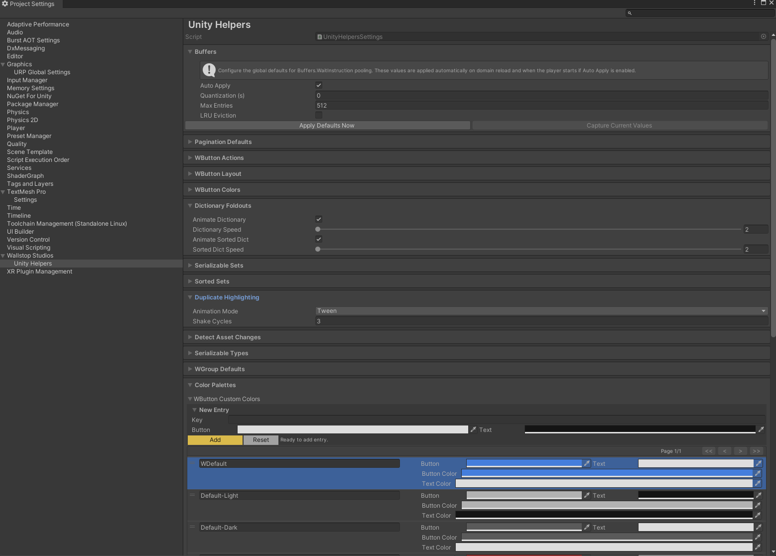
Color Palettes
Palette keys keep WButton and WEnumToggleButtons visuals consistent across the project. Open the Color Palettes foldout inside UnityHelpersSettings to add or edit entries. Each key is matched at draw time against the colorKey parameter on the corresponding attribute; unknown keys fall back to theme-aware defaults.
WButtonCustomColors
Applies to: [WButton] via the colorKey parameter
Reserved keys: Default, Default-Light, Default-Dark, WDefault (legacy)
Description: Each entry stores a button color and a readable text color. Reserved keys auto-sync to the current editor skin and cannot be deleted. Custom keys are ideal for highlighting dangerous or primary actions across multiple inspectors.
Usage:
- Expand Color Palettes → WButton Custom Colors.
- Add an entry (e.g.,
Highlight) and pick button/text colors. - Reference the key from your button:
[WButton("Submit", colorKey: "Highlight")]
private void Submit() { }
WEnumToggleButtonsCustomColors
Applies to: [WEnumToggleButtons] via the ColorKey property
Reserved keys: Default, Default-Light, Default-Dark
Description: Each entry defines four colors (selected background/text and inactive background/text). Use this dictionary to align enum toggle palettes with the rest of your UI or to clearly separate different tool contexts.
Usage: Add a key under WEnumToggleButtons Custom Colors, then assign it per field:
[WEnumToggleButtons(ColorKey = "Difficulty")]
public DifficultyLevel difficulty;
WEnumToggleButtons Settings
EnumToggleButtonsPageSize
See Pagination Settings.
Creating the Settings Asset
The UnityHelpersSettings asset is automatically created on first use, but you can create it manually:
Method 1: Automatic Creation
- Use any inspector attribute (WGroup, WButton, etc.)
- Open the inspector
- Asset is created at
ProjectSettings/UnityHelpersSettings.asset
Method 2: Force Creation
- Open any script with an inspector attribute
- Select the GameObject/asset in the inspector
- Settings asset is generated automatically
Method 3: Via API (Editor Script)
#if UNITY_EDITOR
using WallstopStudios.UnityHelpers.Editor.Settings;

UnityHelpersSettings settings = UnityHelpersSettings.Instance;
// Settings asset is now created
#endif
Example Configurations
High-Density UI (More items per page)
StringInListPageSize: 50
SerializableSetPageSize: 30
EnumToggleButtonsPageSize: 25
WButtonPageSize: 12
Use case: Large monitors, scrolling preference over pagination
Low-Density UI (Fewer items per page)
StringInListPageSize: 10
SerializableSetPageSize: 5
EnumToggleButtonsPageSize: 8
WButtonPageSize: 4
Use case: Laptop screens, prefer focused views
Performance-Focused (Disable animations)
WButtonFoldoutTweenEnabled: false
WGroupTweenEnabled: false
InlineEditorFoldoutTweenEnabled: false
Use case: Slower machines, prefer instant feedback
Smooth Animations (Fast tweens)
WButtonFoldoutSpeed: 8.0
WGroupTweenSpeed: 8.0
InlineEditorFoldoutSpeed: 8.0
Use case: Snappy UI feel
Extensive History (More button results)
WButtonHistorySize: 10
Use case: Heavy testing/debugging workflows
Troubleshooting
Settings Asset Missing
Problem: Can’t find UnityHelpersSettings.asset
Solution:
- Use any inspector attribute in a script
- Select an object in the inspector
- Asset is created automatically
- Check
ProjectSettings/UnityHelpersSettings.asset
Changes Not Applied
Problem: Modified settings but inspector doesn’t update
Solution:
- Ensure settings asset is saved (
Ctrl+SorCmd+S) - Refresh inspector (click away and back)
- Reimport scripts if needed (
Assets > Reimport All)
Color Palette Not Working
Problem: Custom color key doesn’t apply
Solution:
- Check color key spelling (case-sensitive)
- Verify entry exists in the appropriate dictionary (WButtonCustomColors, WEnumToggleButtonsCustomColors)
- Ensure colors are set (not transparent/default)
- Save settings asset
See Also
- Inspector Overview - Complete inspector features overview
- Inspector Grouping Attributes - WGroup layouts
- Inspector Buttons - WButton
- Inspector Selection Attributes - WEnumToggleButtons
Next Steps:
- Customize pagination sizes for your workflow
- Create custom color palettes for project theming
- Adjust animation speeds to your preference
- Configure default button history capacity